|
SELECTED RECENT ARTICLES, REVIEWS & CATALOG ESSAYS
The
Paintings of Joseph Hughes: Icons of Color
Chris Ashley, Joseph Hughes: Selected Paintings
2005-2008
room for painting room for paper, San Francisco, 2008
Hughes
Paintings at Takada
Kenneth Baker, San Francisco Chronicle, September
16, 2006
Joseph
Hughes at Takada
Kenneth Baker, San Francisco Chronicle, October
30, 2004
Seeing
the Hovering Image: Joseph Hughes' Recent Paintings
Chris
Ashley, Look,
See, October 2004
Joseph
Hughes and Color Painting
George Lawson, Joseph Hughes: Paintings 1972-2002,
San Francisco, CA, 2002
The
Image of Color
James Lavino, Joseph Hughes: Paintings 1972-2002, San
Francisco, CA, 2002
|
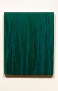
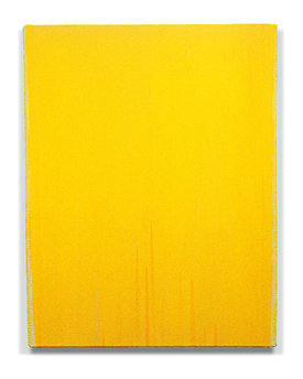
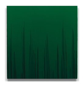
2008/
III (THALO GREEN)
Acrylic/ linen
20.5 x 16.5 in 50.5 x 41.5 cm
|
The Paintings of Joseph Hughes: Icons of Color
From
the catalog "Joseph Hughes: Selected Paintings
2005-2008," room for painting room for paper,
San Francisco, CA, 2008
It
is remarkable to observe that during the fifth decade of
his career Joseph Hughes, whose work has often been seen
in the context of Radical Color Painting, is still experimenting
and innovating. Yet, while assuming Color Painting's primary
concern for the integration of support, surface, medium,
pigment, and mark, Hughes' pursuit of a profoundly visual
experience of color, light, and space remains uniquely open.
Notably, his recent focus on emphatic gesture has resulted
in particularly vibrant and sensitive, beautiful and intelligent
paintings. It has also taken him into a new and exciting
area of discovery.
Hughes'
palette is consistently intense and diverse, often even
unusual. Thalo, Dioxazine, and Acra are powerful and luminous,
yet these staining colors are so difficult to work with
that most artists simply avoid them. But even when Hughes
uses the more common Ultramarine or Siena--and he has a
special way with white and gray--his color remains clear
and brilliant because his command of acrylic medium, used
in alternating glazed and opaque areas, lets him achieve
the jewel-like, lapidary qualities found, for example, in
Rembrandt, whom Hughes greatly admires.
Drawing is now more obviously important to Hughes in ways
rarely found in Color Painting, where instead it is usually
located at the edges of fields, shapes, and the canvas'
periphery. Against Hughes' downward-flowing colored grounds,
lines of paint are literally flung at the canvas; the presence
of the painter's body in making these paintings is clearly
evident. The pressure of thrown paint forces these lines
to subtly fray and splatter out and upward at their edges.
Across the painting's surface, arcs of color gracefully
run parallel, touch, or crisscross, forming variously sparse
or dense fields of interwoven lines.
On
the vertical plane of 2008/III (THALO GREEN), for example,
a few thin dark green lines sketch a basic scaffolding on
a medium green background, over which thicker skeins of
turquoise accumulate as a grove of tangled trunks. The opposing
directions of the downward-flowing background and the foreground
figures reaching up suggest movement and tension, like the
body's struggle to remain upright means resisting gravity's
pull. In this Hughes risks the associations that the figure-ground
dichotomy introduces and that Color Painting usually sidesteps,
which leads to confirming, wrestling with, and wrangling
painting's eternal dualities: abstraction and realism; window
and plane; illusion and surface; picture and object; reference
and thing.
Historically,
as pictures, symbols, and objects, painted icons encapsulate
these dualities, and are vehicles of emotion, belief, and
beauty. Joseph Hughes' paintings are personal icons for
believers in the transcendent experience of color and its
role in exploring the reaches of our psychological and spiritual
nature. They call for and support our discovery of self
via observation, conjecture, intuition, and reason. In experiencing
these paintings we find an ideal, an archetype for a way
to look, think, and feel.
Chris
Ashley
Oakland , California
September 2008
|
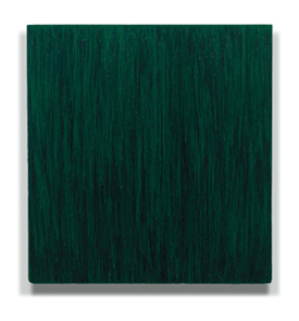
|
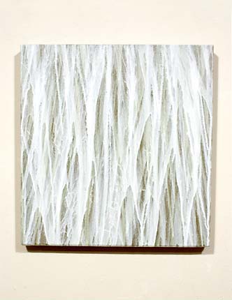
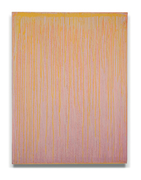
2006/ IV (GREY-WHITE)
Acrylic/linen
18 x 17.5 in 46 x 44 cm
(Private Collection)
|
Hughes Paintings at Takada
Kenneth Baker, San Francisco Chronicle
September 16, 2006
Like
all abstract painters today, Joseph Hughes risks appearing
withdrawn and self-involved in a world on fire. Events have
made people wary of the idealism that abstract painting
once seemed capable of objectifying by exempting itself
from society's traffic in symbols and whimsies. Today's
contending winds of ideological fervor form a climate even
more dully hostile to abstraction than that of good old-fashioned
philistine dismissal.
Hughes'
recent work at Takada still shuns reference, but its austerity
makes room for sour, abrasive sensations in which we recognize
all too readily the texture of everyday consciousness.
Hughes
has slowly loosened his approach in recent years. Faintly
modulated color fields achieved by pouring acrylic have
given way to an inscrutable combination of pouring and brushwork.
In a picture such as "2006/IV (GREY-WHITE)," the
technique produces a thicket of bristled striations that
snags the eye like visual Velcro. Not a pleasing sensation
at first, but surrender to it and the painting, like most
of the others on view, will unfold absorbing ambiguities
of color and space.
Peeling
apart the details of Hughes' work slowly turns into a process
of separating the strands of visual awareness, disentangling
those spun by words from those not.
|
|
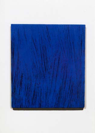
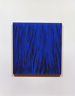
2003/
IV (THALO DIOXAZINE)
Acrylic/ canvas
25 x 22 in 64 x 56 cm
(Private Collection)
|
Joseph Hughes at Takada
Kenneth Baker, San Francisco Chronicle
October 30, 2004
Joseph
Hughes at Takada: Even amid the blare, haste and bluntness
of big media, painting and the other static arts remind
us what significant differences small adjustments can make.
The recent work of San Francisco painter Joseph Hughes,
whose show at Takada ends today, proves the point.
For
years Hughes has made monochrome abstractions by pouring
acrylic over stretched canvases. The smooth sheets of color
that resulted, some with drips trailing at their bottom
edges, achieve a soothing objectivity but at a cost of the
internal energy that abstraction requires to compel attention.
Hughes
continues to work by pouring liquid pigment, lighter hues
over darker grounds, but he has lately taken to guiding
the pours with small brushes. In "2003/ IV (THALO DIOXAZINE)"
the technique has yielded a surface thatched with striations
of color. The marks appear to dance without Hughes' hand
making them do it.
Knowing
his technique takes nothing away from the impression it
creates of paint caught raining down in some parallel climate,
a domain that mirrors our own without imitation, much as
the painter's consciousness does.
Hughes
seems to have worked for years on the threshold of this
discovery. It has finally injected his painting with the
liveliness of expressionism, minus its inevitable hint of
self-indulgence.
|
|
2004/III
(JENKINS GREEN)
Acrylic/ canvas
60 x 56 in 152 x 142 cm
(Private Collection, Tokyo)
2004/II
(THALO DIOXAZINE)
Acrylic/ canvas
18.5 x 17.5 in 46 x 43 cm
(Bergner+
Job Galerie, Mainz, Germany)

2001/
I (CADMIUM RED)
Acrylic/ canvas
48.5 x 41 in 123 x 104 cm
2001/
IV (JENKINS GREEN)
Acrylic/ canvas
18.5 x 17.5 in 47 x 45 cm
2001/
II (HANSA YELLOW)
Acrylic/ canvas
36 x 31 in 92 x 79 cm
|
Seeing the Hovering Image:
Joseph Hughes' Recent Paintings
Chris
Ashley, Look,
See, October 2004
Introduction
Joseph Hughes is showing six paintings at the Takada Gallery
in SF. All are vertical, stout rectangles. Five paintings
are in the eighteen to twenty inch high range, and one painting,
by far the largest, reaches sixty inches in height. All
are painted in acrylic; four, including the large painting,
are on canvas and the final two paintings are on linen.
Walking
in the gallery one initially appears to be confronted with
six monochrome paintings, each a different color, but if
one spends just a little time with the paintings one finds
that there is much more going on here than that. To describe
the making of these paintings in terms that sound like a
system or method is not to say that the paintings are either
systematically or methodically made with a predictable outcome,
that they are all the same but just use different colors;
it simply means that the artist does employ a process that
can be described, and that the paintings are individuals
in a family of work exploring a set of problems on which
the artist is for now focusing.
Shape
& Drawing
Hughes' stretchers are actually trapezoids. The top and
bottom edges are parallel, but the top is slightly wider
than the bottom, which helps the eye make a visual correction
so that the stretcher appears to be square. It isn't something
immediately noticeable, but if you look close enough you'll
wonder if the rectangles are actually square. I thought
I saw that the paintings were not square rectangles and
asked Hughes about this, which he verified.
Most
painters today don't do this, though it's not an uncommon
technique among painters very concerned about the painting
as an object and a perceptual experience. Go back four hundred
years or more to look at, for example, paintings made for
a particular wall high above the viewer in a church; the
height at which the painting is hung requires the viewer
to look up at the painting, thus forcing a foreshortened
view of the painting, meaning that the painting appears
to narrow the higher it gets. If instead the painting is
actually physically wider a certain amount at the top it
will appear to flatten out to the viewer's eye, preserving
the appearance of a square rectangle. The higher the painting,
and the larger it is, the wider it may be along the top
edge. Various tricks like this can be employed to influence
the viewers perception of the work.
If
one doesn't look close enough at the painting to notice
its actual shape then it's easy to accept that it is actually
square, which is how perception works. It's an illusion.
One could call it realism, in the sense of the commonly
accepted use of the word in art: making something appear
real or natural through illusionistic means. That's just
one little argument in the many I could make that abstract
painting is actually realism. It is physical and perceptual,
it is an actual viewing experience itself as well as associative,
provoking feelings within the viewer that are in the moment,
not abstracted or in reaction to a depiction of experience
or feeling. But that's another essay.
Think
of these trapezoids, a means of perceptual correction, even
coercion, as the second piece of drawing the artist undertakes
in making each work. Yes, it is drawing, because it is specifying
a shape: it is a border, a line around what happens inside
the painting and the environment that contains it, and it
is illusory. But actually, the first piece of drawing is
the size of the stretcher, because the size of the stretcher
is a factor in the amount of correction required, determining
the angles of the trapezoid needed to force paintings of
different sizes to read as square. (How is this done? I
don't know; there must be some formula, but I've never done
it myself. That's a little research project.) And speaking
of drawing, and having mentioned how high a painting is
hung, there is a final piece of drawing in making the painting,
typically considered after the actual painting phase of
making the work, which is how high the painting, if it isn't
site-specific, is hung on the wall. I've just described
several drawing decisions to be considered even though a
pencil or brush hasn't even necessarily touched the surface
of the painting yet.
Painting
The actual painting phase in Hughes' process for this group
of paintings requires, as I understand it, basically four
steps after the canvas or linen support is secured over
the stretcher. All painting takes place while the stretcher
is hanging on a wall.
- First,
the surface is covered evenly by a rolled-on colored acrylic
ground; in the series this ground may appear to black,
although it is actually a mixed color.
- When
the first ground is dry another layer of acrylic is applied
over the entire surface. This ground may have some small
amount of acrylic mixed in, but remains transparent. Essentially,
Hughes is using a glaze technique.
- After
the second acrylic layer dries a prepared brush is used
to paint vertical and slightly diagonal strokes of more
fully pigmented acrylic. The prepared brush is a wide,
flat brush modified by cutting out sections of the bristles
to create gaps so that the brush no longer paints an even,
solid stroke. Imagine the original brush like the fingers
on a hand, straight and touching sides, forming a solid
surface. Now imagine spreading the fingers out so that
there are gaps between the fingers. The prepared brush,
like spread fingers, will not paint a solid stroke. This
is yet another drawing decision Hughes makes: he creates
and uses a brush that paints several roughly parallel
and separate smaller brushstrokes at once. In addition,
he attaches the brush to longer handles, from two to six
feet long, so that the brush isn't immediately held in
his hand but is extended several feet from his body, transforming
the act of painting from mere wrist or elbow movement
through his arm and shoulder into the rest of the body.
- After
the stroked colored paint is dry a final coat of lightly
pigmented acrylic is poured over the painting.
The
general approach undertaken at each stage of the painting
is one of allover-- the entire canvas is the area of attack
during each step, beginning with the design of the stretcher,
through the gestural painting, to the final pouring of clear
acrylic. At each stage Hughes is dealing with the entire
surface as a flat field to be filled, marked, or covered.
In the end the painting is a self-contained unit, a single
body comprising several layer, each layer a series of gestures,
smooth or gestural, designed to span and fit the complete
surface. The viewer sees the painting in at least three
modes: as a painted, gestural, flat image fitted over the
surface; as illusionistic light and space through color
and drawing; and as a single object composed of combined
materials integrally locked together.
Subject
& Color
The gestural component of each painting is probably most
easily taken to be the subject of the paintings, and at
least the most immediate level they are, if one thinks that
a painting has to present a figure, or depict an object,
or wear some kind of decoration, and that any of these is
necessarily the subject of the painting. The gesture can
be read as figure, object, or decoration, as a thing that
exists in an environment or on top of a surface. But there
are other components of the painting at work, and the reading
of the gesture as a figure is just one of these components
working in tandem with the others.
The
gesture is dependent on the black, a very uncommon color
over which to paint--putting aside paintings on velvet--as
it tends to kill color primarily because it does not reflect
light back through the color on top to the eye. The two
layers of poured acrylic, however, are a layer through which
light does pass, and these clear layers give each painting
a kind of buoyancy, as if the colored gesture is hovering
ever so slightly. The bottom layer of clear acrylic separates
the gesture from the black ground, and the top layer of
acrylic seals-in the gesture, containing it under a clear
surface and fixing it within the painting. This shallow
space over the gesture wraps the painting up, integrates
its components, and makes it a single object. But these
two planes of clear acrylic do something very subtle and
surprising, something even barely noticeable: the colored
gesture is suspended, floats between two clear sheets, like
a leaf in a book, an insect in amber, or moisture in a double-paned
window, and perhaps even more powerfully: like an image
in a mirror or a window. It is an image not quite there,
faint and hard to hold. The gesture is a record of the artist's
hand, suspended in a strange light in just that moment,
and suddenly the painting has incredible depth, while still
remaining very much a solid object.
The
gesture as an image resembles a flash, a stroke like a small
explosion, a flower underfolding, an action in the moment.
And yet each gesture is a flash as in an idea,
like a sudden thought--something flashed in my head,
or flashed before my eyes-- and is the manifestation
of this idea or thought in an action. The gesture is the
least mechanical and least programmed component of each
painting. As thin, quickly applied, streaky paint , held
between two sheets of acrylic, hovering over a dark background
providing minimal reflected light, the colored gesture is
almost a glimpse, like something fleeting, but of course
is also something static that can be returned to over and
over. With this in mind it may not only be that the gesture
is the primary image of the painting, but that the entire
constructed painting as a fleeting image--black, two layers
of clear acrylic, and a suspended colored gesture--is the
primary image: it's not a literally a mirror or window acting
as a fleeting image, nor is it the painted illusion of a
mirror or a window, but instead is a construction that enables
the experience of looking at and for a fleeting image. I'd
like to suggest that this viewing experience is a primary
subject matter of the paintings, and that possible meanings
to be found in these paintings include: the act of looking
for something; the act of trying to isolate this something;
the act of seeing something closely; the act of trying to
visually hold on to this something; the act of taking time
for looking; and the act of losing sight of something. That
the gesture is barely a something, is almost a nothing,
allows the viewer to look in a way that emphasizes the experience
and the recognition of this experience, not the recognition
of a specific object, place, or person, which would make
the painting a picture of something rather than something
in itself.
The
poet Jim Harris helps to illustrate this idea of looking
and recognition as a flash by identifying"the many
Japanese Haiku poets who make use of the lightning flash
as an initiating event (and metaphor) for a complete and
fleeting instant of sudden perception[1]." These poems,
all translations by Robert Hass, also connect to the ways
I've attempted to delineate of experiencing the marks and
imagery in Hughes' paintings::
How
admirable!// to see lightning and not think// life is fleeting.
-- Basho
Lightning
flash--// what I thought were faces// are plumes of pampas
grass. -- Basho
A
dry riverbed// glimpsed// by lightning. -- Issa
Harris
provides a final Haiku which frames "an act of layered
perception with the strobe of a glimpse, which seems analogous
to... the end-product... of Hughes' method" I describe
above as a suspended, just-caught image:
Calligraphy
of geese// against the sky--// the moon seals it. -- Buson
In
this recent body of Hughes' work, however, there is an exception.
In the smaller paintings the colored gestures barely cohere
into something more than a slight spray, fan, or web-- the
flash--which makes them better able to integrate into a
painted object. The largest painting is quite a different
story. It is covered and filled with a density of strokes
that are roughly the same size as those in the smaller paintings.
Where the smaller paintings more easily navigate the image/object
dichotomy, the larger painting, filled with overlapping
strokes, so much more readily reads as a picture. By this
I mean something more than the obvious ways in which the
many clustered strokes can begin to look like blades of
grass, a field, falling or spraying water, or crystals,
though they can do that, too. I mean that these bundles
of strokes cluster into shifting angles and form what might
conveniently be called a cubist kind of space: twisting,
sudden changes of directions, and overlapping. This space
is one which the viewer experiences and enters, moves within
and can find places to anchor to. The large painting, because
of its size and the accumulation of strokes, can't possible
provide the intimate experience that the smaller ones do.
It is a window onto a place with fixed spaces, and so is
a representation, a picture. In this respect the large painting
never becomes an integrated object.
Craft
& Presentation
Hughes' paintings are finely crafted. How they are made
is clear and consistent. I was most impressed by the bead
of acrylic that runs along and stops at all four edges of
the canvas as a kind of border. The evenness of surfaces,
the fine marks, and the clean edges of the canvas are evidence
of the great care with which these paintings have been produced.
These details are not small things; to be attuned to this
aspect is to find signs that point the way towards the value
of close looking, a way that, if followed, shows the viewer
that everything counts, that to not closely observe every
aspect of each painting is to miss the content and meaning
of the paintings. Hughes' conscious, intentional decisions
and process, made plain to the careful observer, and the
craft by which his decisions and process are carried out,
are indicators of the deeper purpose and content of his
work. His craft makes possible the joyful rewards from moments
of visual concentration and contemplation.
[1]
Excerpted from an email from Jim Harris to the author on
October 23, 2004.
|
|
2001/
VI (WHITE)
Acrylic/ canvas
36 x 31 in 92 x 79 cm
1999-2000/
I (HANSA YELLOW)
Acrylic/ canvas
26.5 x 21 in 67 x 53 cm
|
Joseph Hughes and Color Painting
George Lawson, Joseph Hughes: Paintings 1972-2002,
San Francisco, CA, 2002
During
the late 1970's and early 1980's I was painting in close
dialogue with a circle of artists in the Bay Area who were
exploring the range of experience available through the
material structuring of color. A seminal figure in that
group of artists was Joseph Hughes. His work, along with
our many discussions, left a profound impression upon me.
In
the intervening twenty-odd years, the "Color Painting"
movement has grown to include dozens of serious practitioners
all over the world, and many of the painters from that original
circle have gone on to gain national and international reputations.
While
the Color Painting movement now enjoys multinational attention,
it can claim substantial roots in the Bay Area, stemming
perhaps from the time Still and Rothko spent teaching here.
Anne Appleby, Joseph Marioni, and Phil Sims studied at the
San Francisco Art Institute. David Simpson and John Zurier
continue to work here, as did John Meyer before his untimely
death this year. From an art historical standpoint, Color
Painting belongs as much to our regional heritage as the
figuration of Park, Bischoff, and Diebenkorn.
From its inception in the Bay Area, Joseph Hughes has been
a key figure in the Color Painting movement. Working quietly
and steadily in his San Francisco studio, he has exerted
a strong influence on the Color genre.
Hughes
is an intelligent spokesperson, but more importantly, he
is also an intelligent painter. He has resolved, perhaps
better than anyone else working today, the dauntingly complex
relationship between the immaterial aura of color and the
physical support that generates the color image. This is
no small task. It is something on the order of resolving
the dichotomy between body and soul.
Moreover,
Hughes has won this resolution not through some stylistic
conceit or conceptual positioning, nor through any strategy,
but rather though the inherently slow process of maturation.
Hughes's genuine accomplishment is due in part to the knowledge
of painting he has acquired over the years, and in part
to his accumulated wisdom about the fluid nature of color.
Considered physically, Hughes' painting keeps the color
superbly grounded to the surface of the canvas; considered
metaphysically, his painting assures us with equal credibility
that color resides in an immaterial realm.
This
exhibition, a survey of Joseph Hughes's paintings from the
past thirty years, gives us a unique and welcome opportunity
to experience his work in fullness, and to enjoy the rewards
of his remarkable achievement.
San
Francisco, 2002
|
|
1973/
A6 (YELLOW RISING),
Acrylic/ canvas
62.5 x 47.5 in 156 x 121 cm
1987/
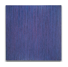
III (DARK BLUE VIOLET)
Acrylic/ canvas
72 x 72 in 183 x 183 cm
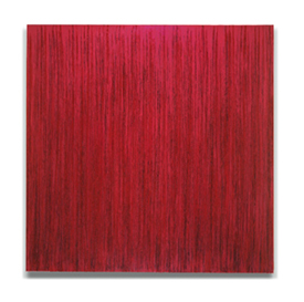
1989/
IV (RED VIOLET)
Acrylic/ canvas
76 x 76 in 193 x 193 cm
1990/
I (CADMIUM YELLOW)
Acrylic/ canvas
36 x 36 in 92 x 92 cm
1994/
IV (HOOKERS GREEN)
Acrylic/ canvas
50 x 49 in 127 x 125 cm
1999/
IV (THALO DIOXAZINE)
Acrylic/ canvas
26 x 24 in 66 x 61 cm
(Private Collection)
2001/
I (CADMIUM RED)
Acrylic/ canvas
48.5 x 41 in 123 x 104 cm
|
The
Image of Color
James Lavino, Joseph Hughes: Paintings 1972-2002,
San Francisco, CA, 2002
For
thirty years, through a continuous refinement and adjustment
of his painting process, Joseph Hughes has been engaged
in a single adventurous pursuit: an exploration of the physical,
psychological, and spiritual content of color. Throughout
these decades, Hughes has remained focused on distilling
the act of painting to its fundamental essence. His quest
is to realize paintings that are free from the bounds of
representation, free from the struggle of the ego, yet articulate
their full expression as actualized images of color
Hughes
came to color abstraction as a young painter in the 1960s
through his study of the heroic figures of the New York
School, notably Rothko, Pollock, and Kline. His indebtedness
to those painters is reflected in his lyrical abstract paintings
of the time, which made subtle references to landscape in
horizontal compositions of stratified passages of color.
As
his composition became more individuated and his involvement
with color deepened, Hughes came to understand that his
true subject matter was color itself. He therefore began
to eliminate all representational references from his work
and to focus exclusively on developing each painting into
a unique image of color. As a result, each painting reveals
itself as a kind of ideal presentation of its essential
color, with all elements of the painting- size, shape, color,
and format- in harmonious support of the color image.
By
1972, all of these elements were at work in Hughes' paintings.
For example, he began to emphasize the "objectness"
of the paintings by altering the edge of each work's support.
More extroverted works were made wider at the edge in order
to project more from the wall and therefore have a more
assertive presence. Hughes also changed his painting process,
eliminating the stratified color passages that had characterized
his earlier work. Instead, he filled nearly the entire field
of the canvas with layered glazes of complementary colors.
The basic color of each glaze feathers out at the edge of
the composition, giving the work a kind of optical frame
that causes the eye to search for the individual color of
each glaze without the multi-layered context of the body
of the painting.
In
order to involve the entire compositional field more actively
in the color structure of the painting, Hughes began to
investigate the technique of pouring the paint to animate
each glaze as it was applied. In the 1973 painting 1973/
A6 (YELLOW RISING), for example, we can see how the
pouring activates the structure of the color, adding a sense
of resolute and perpetual motion to the work. At the same
time, below the energy of the painting's active surface,
there lies a quiet richness and subtlety of color. This
unique relationship between surface and depth, between movement
and stillness, has remained a constant in Hughes's work.
In
the paintings of the late 1970s and 1980s there is a stronger
sense of gesture in the work. Hughes returned to the brush
as his primary painting tool, using brushes specially prepared
to give him a wide range of gestural possibilities. Generally,
these were large, rough horsehair brushes, mounted on long
poles that enable him to keep the entire painting in view
as he brushed with strong vertical strokes. The roughness
of the brushes worked each pigment into filaments that,
mingling optically with the other colors, created the impression
of a new, single composite color.
The
visual effect of these paintings is striking. Each painting
at first appears to be monochromatic, but as the viewer
contemplates the painting further, the "single color"
is revealed to contain a multitude of hues. Suddenly stark
differences in color are visible, and it becomes clear that
the apparently monochromatic image is in fact made up of
many separate interweaving colors. As we can see in 1987/
III (DARK BLUE-VIOLET), the single color image projects
the richness of its many complementary colors, much as a
"green" water lily painting by Monet projects
the richness of the distinct blues, violets, and yellows
of which it is composed.
In
the paintings at the end of the 1980s, such as 1989/IV
(RED VIOLET), there is a greater sense of fluidity
in the brushwork. One senses a stronger acknowledgement
of paint as an inherently liquid medium. The paint has been
allowed to flow more naturally, with less articulation by
the brush, especially in the later applications, giving
the painting a looser, freer feeling.
This
enhanced involvement in the fluidity of the paint continued
to develop, and by the following year Hughes had come to
define paint as "liquid color." In order to explore
this notion more freely, he returned to pouring as his primary
painting technique. In the painting 1990/ I (CADMIUM
YELLOW), for example, the entire color structure is
defined by a series of poured glazes. In these paintings
generally the paint remains fairly solid at the top of the
canvas, but as each new glaze proceeds toward the bottom,
it gathers into rivulets, leaving areas of the previous
layers exposed.
There
is an overall shift during this period toward an emphasis
on the objectness of the paintings, as Hughes focused on
integrating each work's physical properties with its psychological
concerns. The supports of the paintings are shaped more
radically, so that the stretcher tapers toward the bottom
to complement the paint as it flows down the canvas. A spacer
has been added to the back of the support, enabling the
painting to assert itself as a defined object hanging on
the wall, rather than seeming to be an architectural detail.
And the back edge of the stretcher has been rounded, so
that visually the edge flows more easily toward the space
separating the painting from the wall.
During
this period, too, Hughes was refining the translucent glazing
techniques he had been using for a number of years, creating
an effect reminiscent of Vermeer and early Rembrandt, who
had used glazing to achieve luminous qualities of depth
and resonance. As the decade progressed, Hughes concentrated
more on this aspect of work, allowing each glaze to flow
over most of the canvas before tapering off at the sides
and the bottom. In paintings like 1999/ IV (THALO DIOXAZINE),
these large areas of glazed color invite intent observation
into their depths, much as a quiet lake invites the observer's
gaze.
The
current work has taken on a renewed muscularity, as Hughes
has returned to involving more of his own personal gesture
in structuring the color. He is using brushes again, for
the first time in many years, and there is a sense that
he is working more in the paint, rather than merely
with the paint. This is not simply a return to
an earlier style, but an incorporation of the glazing techniques
of the 1990s with the more gestural brushwork that had marked
his earlier paintings of the 1980s.
An
important aspect of this new incorporation is Hughes's method
of applying the paint. Rather than using the more traditional
process of dipping the brush in the paint and then applying
it to the canvas (as he had done in the earlier work), Hughes
now pours the paint onto the canvas before working with
the brush, using the liquidity of the paint to create a
lattice-like structure of brushstrokes over the entire canvas.
Because
of the translucency of the glazing, the current works appear
much more immediately monochrome than the earlier brushed
works, in which the individual applications of paint were
more opaque and therefore more readily discernable. In 2001/
I (CADIUM RED), for example, careful observation reveals
that the apparently single hue of red is actually made of
of many layers of pigment, but unlike in the works of the
1990s, these glazes have been interwoven by the brush creating
an energetic surface texture that is enriched by the layered
depths of articulated color.
A
survey of these three decades of Hughes's painting shows
us an extraordinarily rich body of work that has been realized
within a framework of exceptional consistency. Like the
paintings themselves, Hughes's project immediately impresses
with its singleness of purpose, but upon reflection reveals
an astonishing range and complexity. Unfettered by the limiting
properties of narrative and representation, Hughes has for
thirty years been engaged in a focused exploration of the
nature of color, and through the actualized images of color
he has created we are free to participate with him in that
infinitely rewarding experience.
New
York, 2002
|
| |
EXTENDED
BIBLIOGRAPHY
Baker,
Kenneth. "Galleries,"
San Francisco Chronicle, December 20, 2008.
Ashley,
Chris. "The Paintings of Joseph Hughes: Icons of Color,"
Joseph Hughes: Selected Paintings
2005-2008,
room for painting room for paper, San Francisco, 2008.
Baker,
Kenneth. "Hughes Paintings at Takada,"
San Francisco Chronicle, September 16, 2006.
Baker,
Kenneth. "Joseph Hughes at Takada,"
San Francisco Chronicle, October 30, 2004.
Ashley,
Chris. "Seeing the Hovering Image: Joseph Hughes' Recent
Paintings,"
Look, See, October 2004.
Lawson,
George. "Joseph Hughes and Color Painting,"
Joseph Hughes: Paintings 1972-2002, San Francisco,
CA, 2002.
Lavino,
James. "The Image of Color,"
Joseph Hughes: Paintings 1972-2002, San Francisco,
CA, 2002.
Weinstock,
Nino. Radical Painting und Prasenz der Farbe, Richter
Verlag, Dusseldorf, 2001.
Bonetti,
David. "Berkeley Museum: Showing Off Its Assets,"
San Francisco Chronicle, March 4, 2001.
Lewallen,
Constance. "Minimalism Then and Now,"
Look (Berkeley Art Museum), Fall, 2000.
Lavino,
James. "Movement and Stillness,"
Color Based Painting, 1999.
Kokot,
Sharon. "Colors Speak for Themselves,"
Columbus Dispatch, April 11, 1999.
Schieber,
Curtis. "Radical Concrete's Rock-Solid Modernism,"
Dialogue, March/April, 1999.
Clark,
Margaret Anne. "Painting as Meditation,"
Artviews, October, 1998.
Bonetti,
David. "Taking Abstraction to Ground Zero,"
San Francisco Examiner, April 12, 1996.
Baker,
Kenneth. "Joseph Hughes at Takada,"
San Francisco Chronicle, October 21, 1993.
Bonetti,
David. "Art: At the Galleries,"
San Francisco Examiner, September 22, 1989.
Baker,
Kenneth. "Abstracts with Depth, Complexity,"
San Francisco Chronicle, September 21, 1989.
Brunson,
Jamie. "Bay Area's Response to Postmodernist Abstraction,"
Visions, Spring, 1989.
Baker,
Kenneth. "Displays of Paintings, Not Pictures,"
San Francisco Chronicle, September 19, 1988.
Anonymous.
"In Brief,"
L.A. Art Scene, July/August, 1987.
Gardner,
Colin. "The Art Galleries/La Cienega Area,"
Los Angeles Times, June 19, 1987.
Albright,
Thomas. "Joseph Hughes,"
Art in the San Francisco Bay Area: 1945-1980, 1985
Cebulski,
Frank. "Color As Perception,"
Art Week, January 22, 1983.
Albright,
Thomas. "Personal, Fresh Approaches,"
San Francisco Chronicle, January 13, 1983.
Albright,
Thomas. "Colorful Canvases,"
San Francisco Chronicle, February 27, 1982.
Albright,
Thomas. "San Francisco,"
Art News, January, 1976.
Dunham,
Judith L. "Joseph Hughes' Dual Series,"
Art Week, November 22, 1975.
Albright,
Thomas. "Catching the Art Critic Off Garde,"
San Francisco Chronicle, November 15, 1975.
Bowles,
Jerry. "Young Artists Leave Big Sur for Big Apple,"
Staten Island Advance, June 2, 1974.
Albright,
Thomas. The Way It Was: San Francisco,"
Art Gallery, October, 1972.
Allman,
Paul. "Three Artists In Their Quest for Vision,"
San Francisco Phoenix, September 13, 1972.
Fried,
Alexander. "The Lively Arts,"
San Francisco Examiner, August 17, 1972.
Albright,
Thomas. "Hughes' Studies in Colors,"
San Francisco Chronicle, August 3, 1972.
Albright,
Thomas. "Fragile Watercolor Abstractions,"
San Francisco Chronicle, August 21, 1970.
|
|